Fryer’s
A fast-food identity built to feel loud, quick and unmistakably Fryer’s.
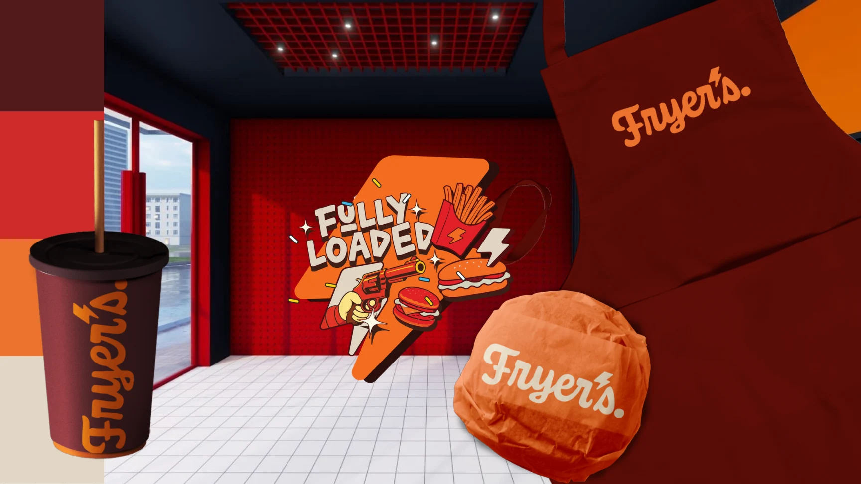
A bold script mark, high-contrast colour and illustrated language carry the brand across the restaurant and its packaging.
Case study01 / THE WORK
An identity with appetite.
Deep red and sharp orange hold the system together. The illustrated “Fully Loaded” language gives Fryer’s its own energy in-store and on-pack.
One visual language, from the wall to the wrapper.
View the complete project on Behance